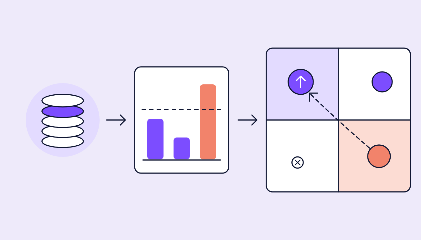
One video, three platforms, three truths
The same video runs on Meta, TikTok and YouTube at the same time. The monthly report shows average watch time per platform, side by side. YouTube leads, TikTok sits in the middle, Meta trails. The obvious conclusion: move budget towards YouTube.
This is where it gets risky. The three numbers share a name and a unit, but they do not measure the same thing. Every platform counts views differently, divides watch time by a different base and serves videos in a different environment. Compare AWT across platforms 1:1 and you mostly compare measurement logic, not creatives.
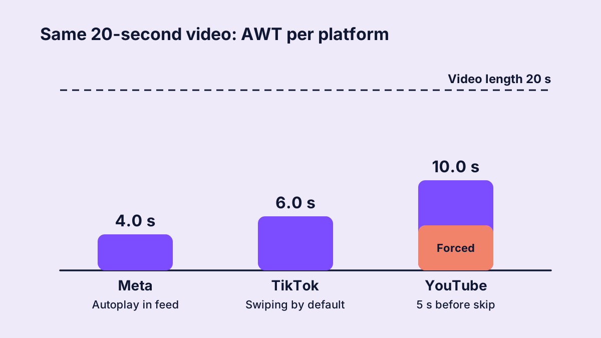
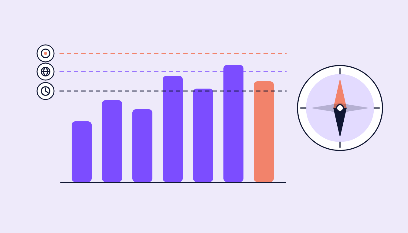
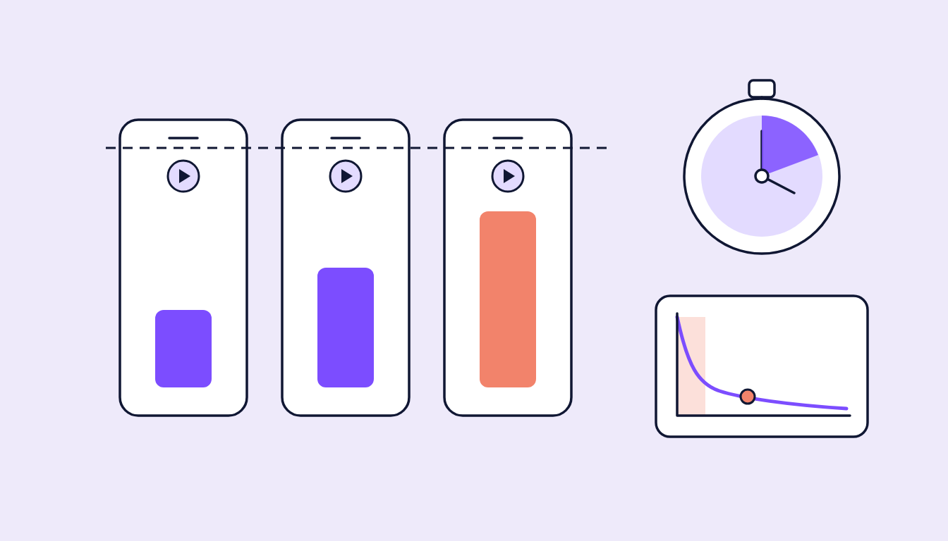
Figure 1: Worked example. Same video, three platforms, three AWT values. Much of the gap comes from how each platform counts.
What AWT actually measures
The basic formula is simple:
Total watch time / Base
The interesting part is the denominator. The base can be the number of impressions, the number of plays started or the number of people reached. And the numerator varies too: do replays count? Does the video start on its own? Can people skip?
Two questions come before any comparison:
- What is it divided by? Per view, per impression or per person.
- What counts as a view in the first place? Any play, two seconds, six seconds, 15 seconds or 30 seconds.
Where the differences come from
Meta: autoplay in the feed
On Facebook and Instagram, videos in the feed usually start automatically. Many plays begin without anyone pressing play. Anyone who keeps scrolling adds a play of a second or less and pulls the average down. Meta's average play time relates to the individual delivery, not to the person.
Then there is the ThruPlay: it counts when a video is watched to the end or for at least 15 seconds. ThruPlay is a threshold of its own and not the same as AWT. But optimising for ThruPlays often produces a different watch time than optimising for reach.
TikTok: 2 seconds, 6 seconds and per person
Besides video views, TikTok reports 2-second and 6-second views. For watch time there are two variants: average play time per video view and average play time per user. Sounds like a detail, makes a real difference (more on that below). TikTok also runs full screen, where swiping is the default, so the first one or two seconds decide more harshly than elsewhere.
YouTube: skipping and mandatory seconds
With skippable in-stream ads on YouTube, the audience has to watch the first five seconds before the skip button appears. Those seconds land in watch time almost automatically. In Google Ads, a view for these formats is only counted after 30 seconds (or the full video if shorter) or an interaction. Shorts, bumper and in-feed formats have their own rules. So a high YouTube value can partly be down to the mandatory time before the skip.
Per view or per person: the silent multiplier
The biggest pitfall is the base. Divide watch time by impressions and you get the value per delivery. Divide it by reach and you get the value per person. The difference is exactly the frequency (impressions / reach):
AWT per person = AWT per view * Frequency
A worked example: a video gets 100,000 impressions with 70,000 people reached, so frequency is about 1.43. In total, 350,000 seconds were watched.
- Per view: 350,000 / 100,000 = 3.5 seconds
- Per person: 350,000 / 70,000 = 5.0 seconds
Same video, same watch time, 43% more AWT, purely from the division. At a frequency of 1.5, per-person AWT reads 50% higher; at 2, it doubles. The higher frequency climbs, the wider the gap.
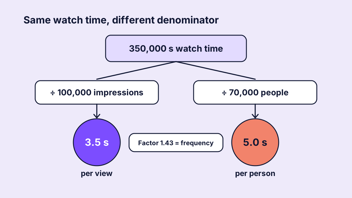
Figure 2: Worked example. The same 350,000 seconds, divided once by impressions and once by reach.
Why naive AWT tables misallocate budget
Say a brand compares a 20-second video across three platforms and sees 4 seconds on Meta, 6 seconds on TikTok and 10 seconds on YouTube. The table suggests pulling budget from Meta. Adjusted for mandatory seconds, base and autoplay, the video may actually hold attention best on Meta, measured against what is normal there.
Typical wrong calls:
- A platform is declared the winner because its counting is more generous.
- A creative is rated weak even though it holds above average on its own platform.
- Short videos lose to long ones because absolute seconds are compared.
- Older campaigns with high frequency look better when calculated per person.
How to read AWT properly
Relative to video length
Six seconds of AWT is strong for an 8-second video and weak for a 60-second one. So length always belongs next to it, for example as a share:
AWT / Video length
Within the platform
Compare Meta with Meta, TikTok with TikTok, YouTube with YouTube. Ideally also the same placement and format: Reels not against feed video, Shorts not against in-stream.
Against your own benchmark
The best reference is the average of comparable own assets on the same platform. A creative 30% above your own TikTok average is a clearer signal than any absolute number of seconds. Across platforms, you can then compare these relative deviations, not the raw values.
With the retention curve
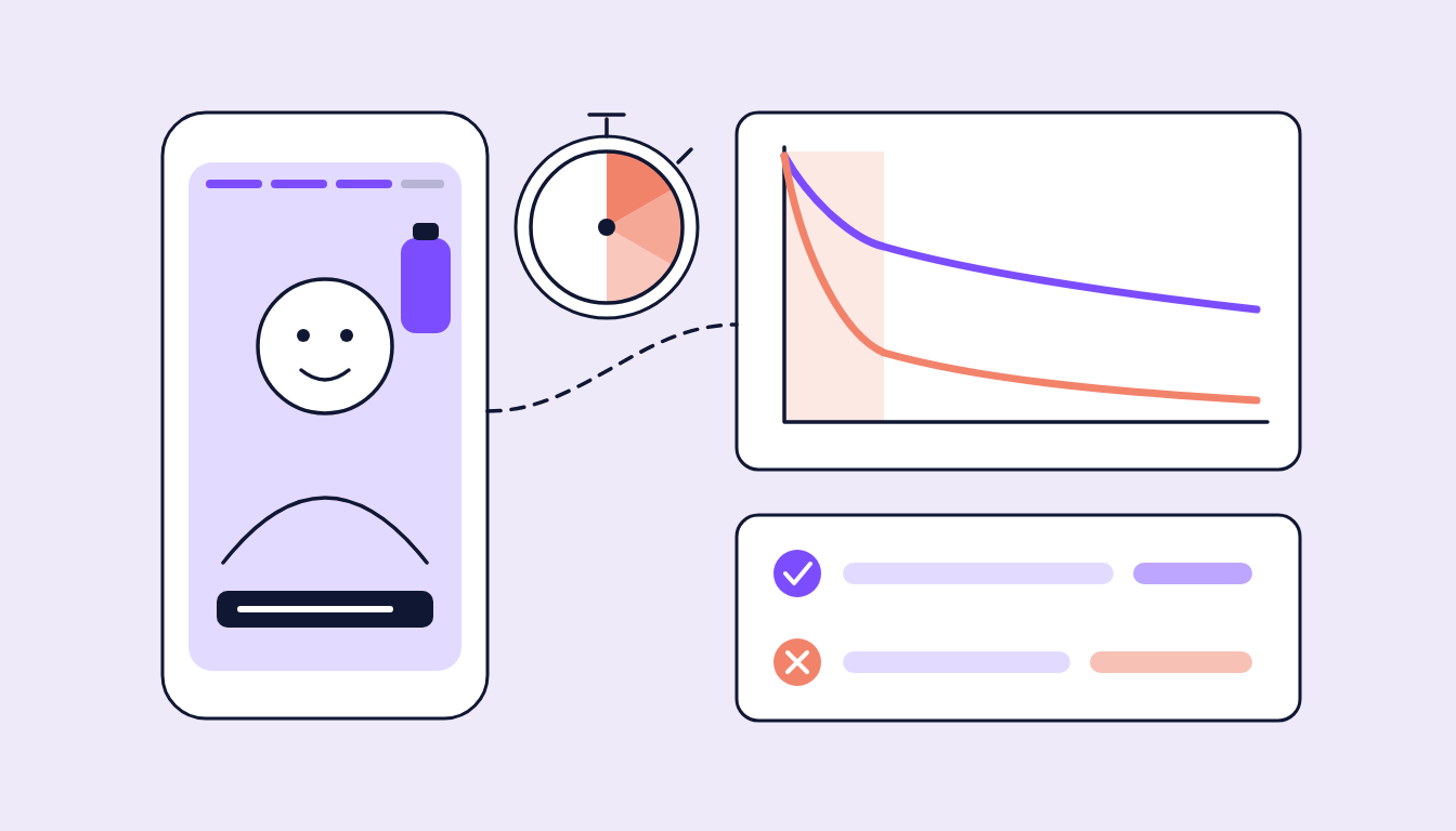
AWT is an average and hides the shape. Two videos with the same AWT can work completely differently: one loses everyone immediately and holds a small core for a long time, the other loses people evenly. What matters is how many people drop off at the hook and how many reach the moment when brand and message appear.
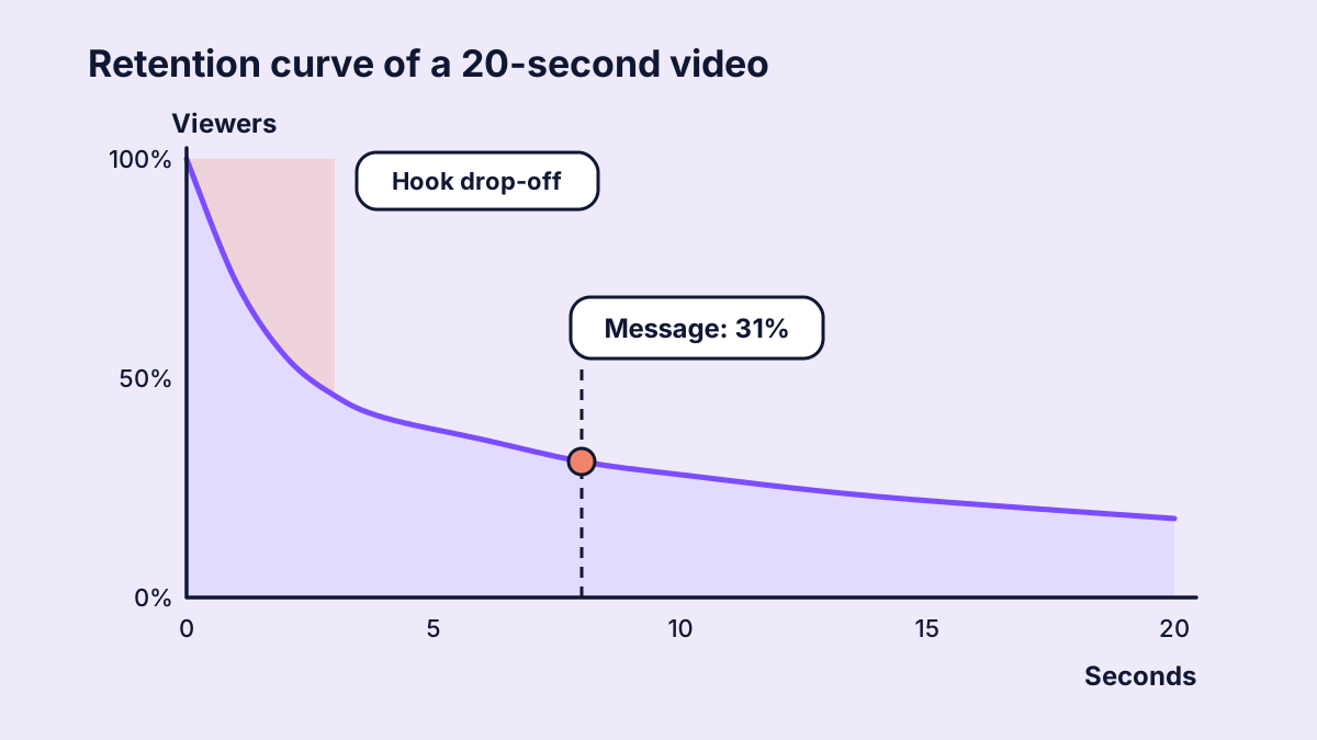
Figure 3: Worked example. The retention curve shows where the hook loses people and how many still see the message.
Within the right objective
AWT is an awareness KPI. In traffic or conversion campaigns the platform optimises towards entirely different people, and watch time says little about success there. Averaging AWT across all campaign types mixes audiences and goals.
How sugarLENS handles average watch time
In sugarLENS, AWT is the ranking KPI for awareness creatives. To keep the number comparable, we never use a per-person value: every platform's watch time is taken per delivery or per view. For TikTok, that meant switching from the per-user variant to the per-view variant and converting the history accordingly. Time ranges are aggregated impression-weighted, not as an average of daily averages. Where an AWT only covers branding campaigns, it is labelled that way.
Ranking happens per campaign objective, optionally per platform, with minimum spend and reach so no low-budget fluke ends up on top. AI vision then analyses the top and bottom creatives for hook, pace, product presence and CTA placement. A number of seconds becomes an explanation, and the explanation a better brief.
FAQ
Can AWT be compared between TikTok, Meta and YouTube at all?
Not as a raw value. What works is comparing relative values: AWT as a share of video length, and the deviation from your own benchmark on each platform.
What is the difference between AWT per view and per person?
Per view divides watch time by impressions or plays, per person divides it by reach. The per-person value is higher by the frequency and grows as the campaign runs.
Is ThruPlay the same as average watch time?
No. ThruPlay is a Meta threshold: the video was watched to the end or for at least 15 seconds. AWT is the average watch time across all deliveries.
What is a good AWT?
That depends on platform, format and length. A good starting point is the share of video length compared with the average of your own assets on the same platform.