Three seconds decide whether the rest gets watched at all
A video can have a strong idea and a great ending. If the first three seconds fail, hardly anyone sees it. In the feed people swipe on, often before the story has started.
Each platform measures this moment differently. Meta counts 3-second video plays and ThruPlays (15 seconds, or the whole video if it is shorter). TikTok reports 2-second and 6-second views, so there the 2-second view stands in. A simple metric for the opening:
Hook Rate = 3-second views / Impressions
Hook rate shows how many impressions survived the opening, not why. We answer that with a comparison: what do the strongest videos in an account do differently in their first seconds than the weakest?
The comparison: top 10 vs bottom 10, per account and objective
A video is only good or bad compared with videos that had the same job, so we always rank inside a clear frame:
- Per account and platform: a brand is compared with itself, not with an industry average.
- Per objective: awareness videos by average watch time (reach campaigns by CPM), engagement by engagement rate, traffic by CPC, sales by cost per order.
- With minimums: a video with little spend and a few hundred impressions cannot top the list by accident.
From that ranking we take the ten strongest and ten weakest videos. The top 10 show what to repeat. The bottom 10 show what to avoid.
A video only counts as above or below benchmark when it has enough data and enough comparable videos exist. Otherwise the verdict says so: not enough data. The verdict comes from the benchmark, not the rank, so a solid video does not become a loser for sitting at the back of a small pool.
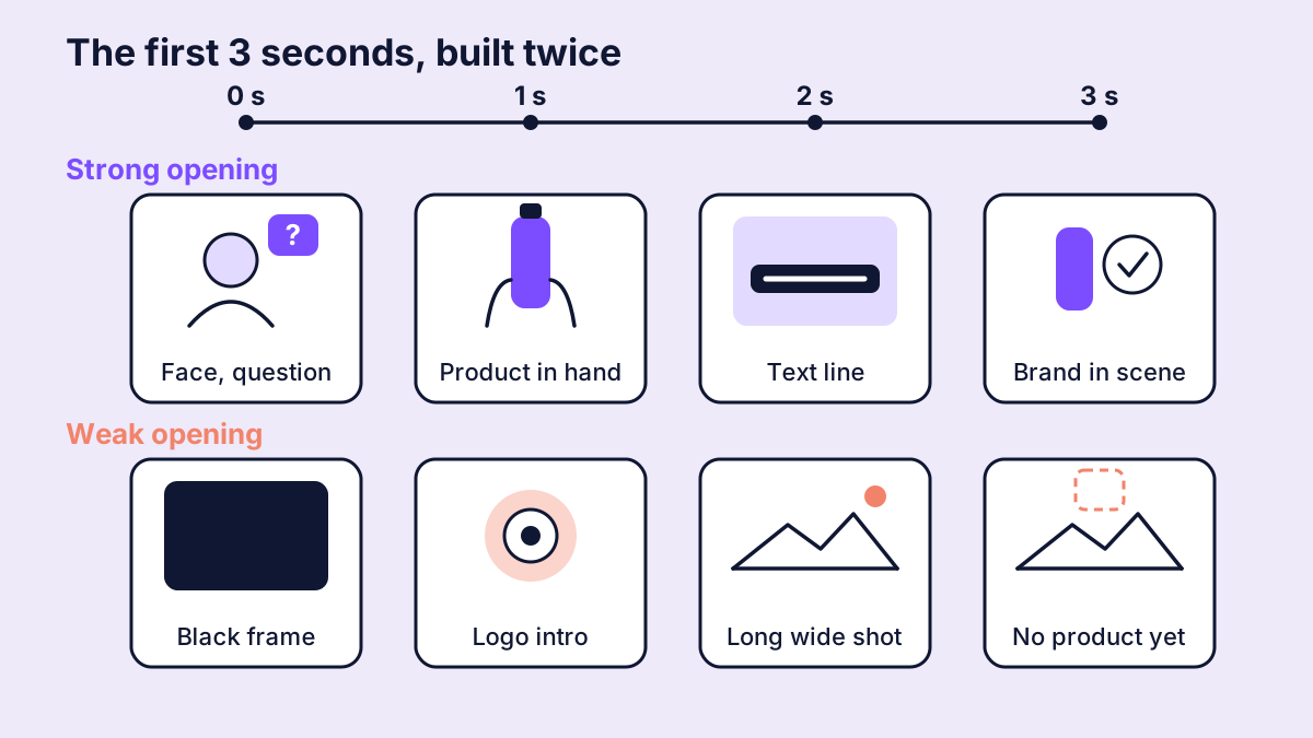
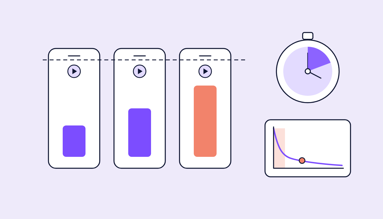
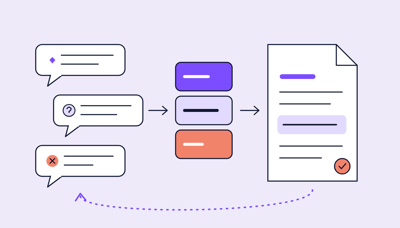
Figure 1: The same three seconds, built twice. Above, something happens at once; below, the video waits for itself.
What an AI sees when it watches the whole video
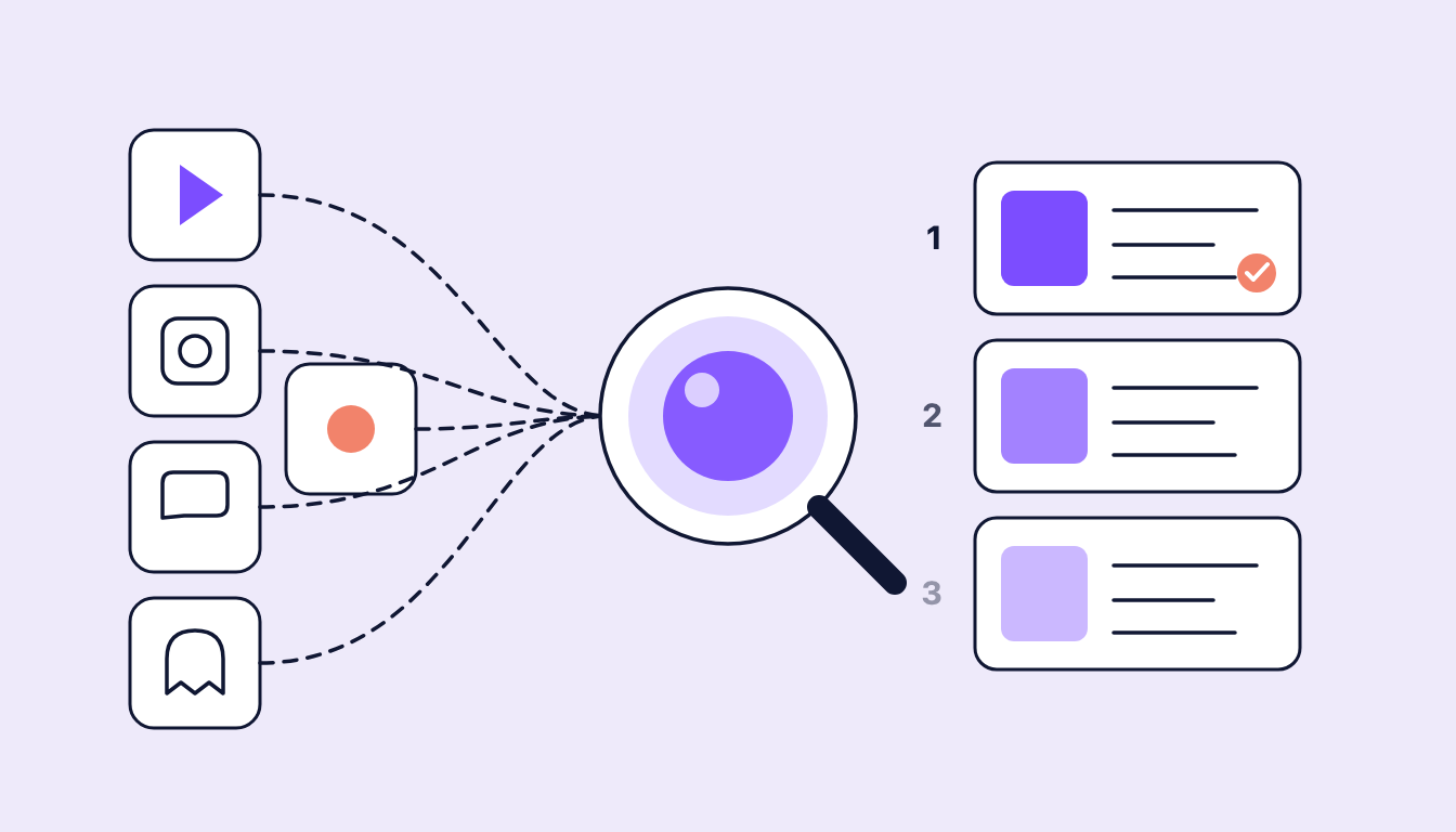
A thumbnail says little about an opening, so the AI in sugarLENS watches the video itself wherever the clip can be fetched. It runs on each account's five strongest and five weakest videos; others can be analysed individually. It describes, among other things:
- Hook: what happens in the first three seconds? The opening shot, its movement, spoken words and on-screen text.
- First brand moment: the second the brand first appears, and how: spoken, sung, on-screen text, logo overlay, logo in scene or product.
- Product presence: early, late, dominant or subtle?
- Pace and cuts: fast-cut, slow-burn, dynamic or calm, from the actual cut frequency.
- Text overlay: is there text on screen, and where does it sit?
- CTA placement: when and where the call to action comes.
- Angle and storytelling: emotional, functional, aspirational or social proof, and the story structure.
Where only a still frame is available, as with many creator and Spark ads, the analysis says so and leaves time-based fields empty.
The result is a short explanation of why the video sits above or below its benchmark, plus what to repeat or avoid.
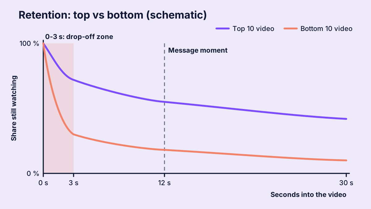
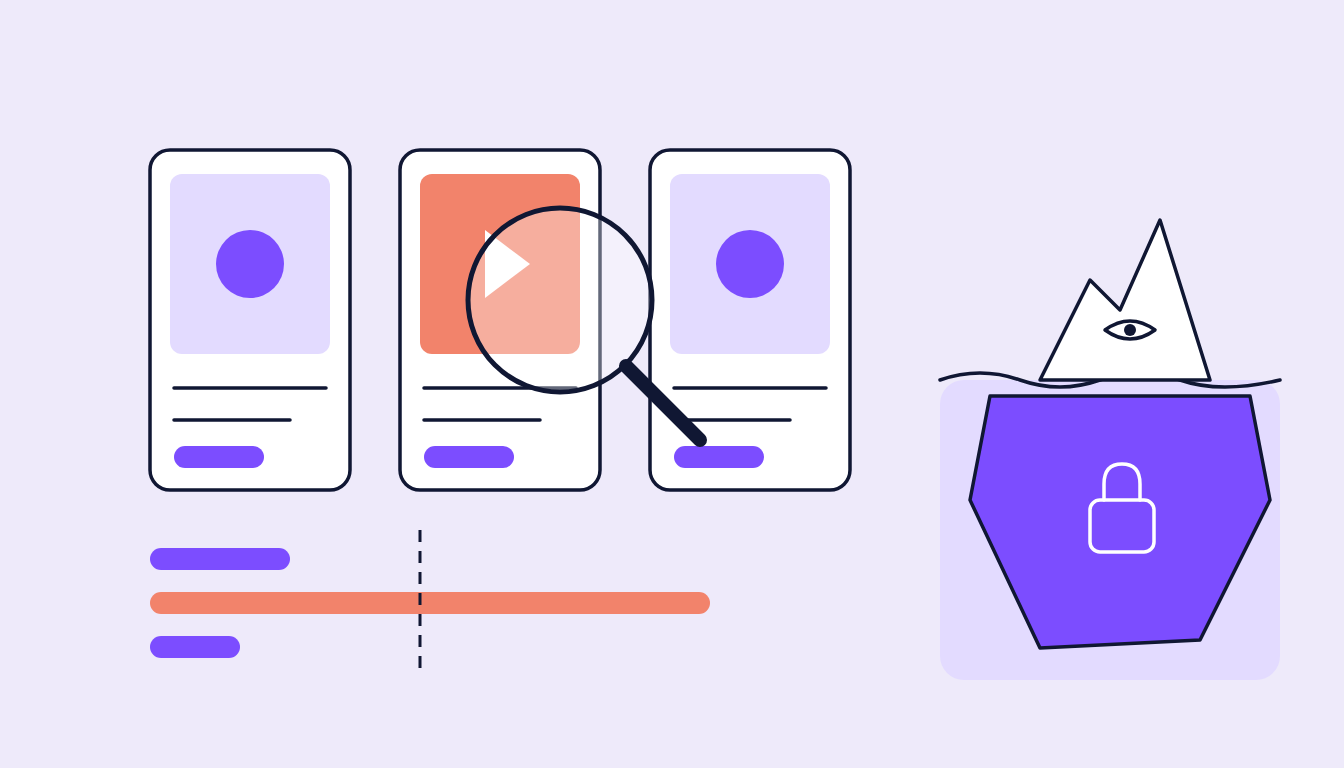
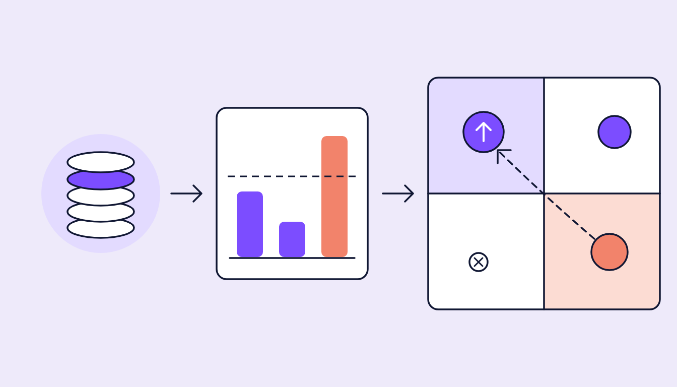
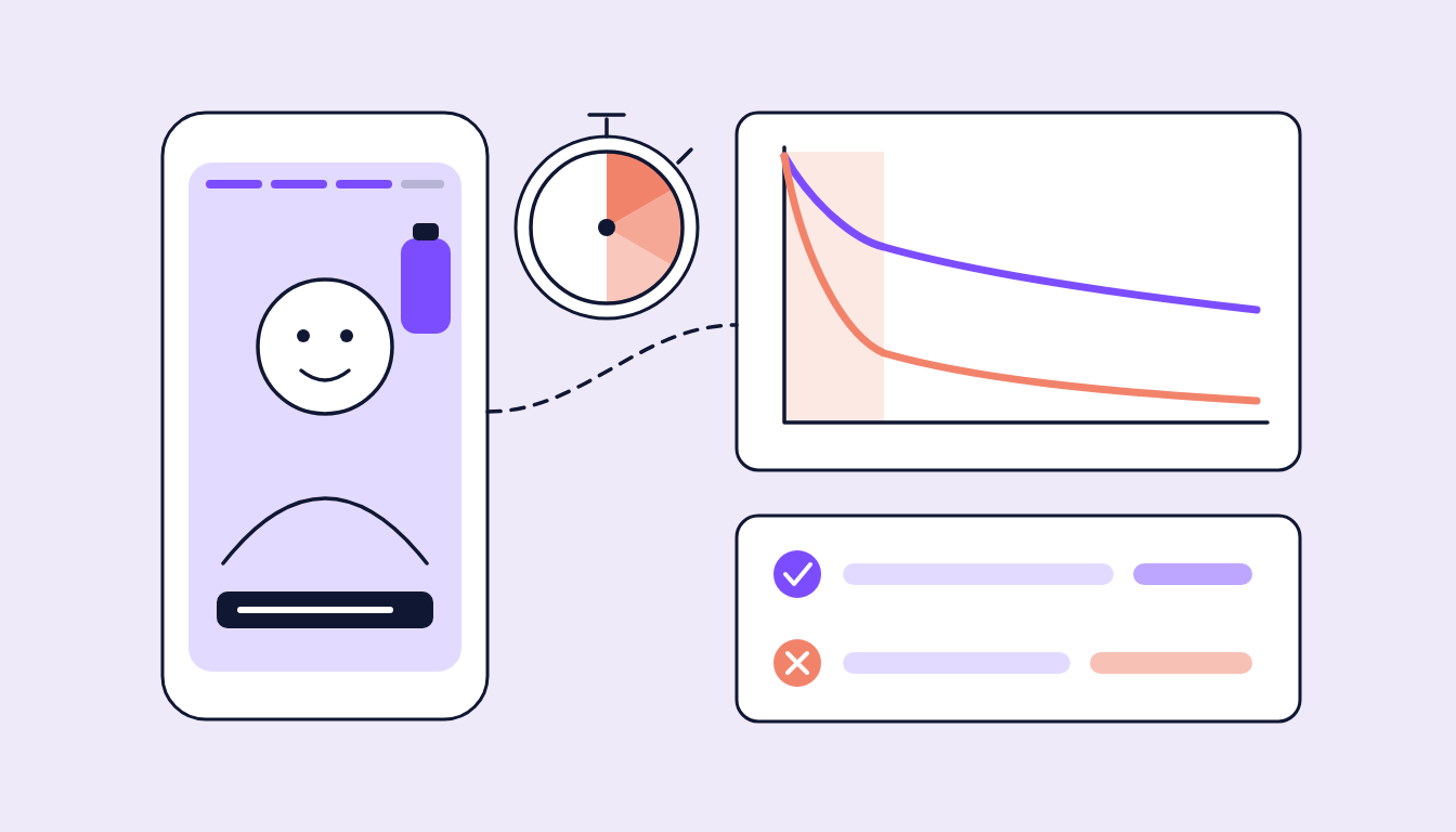
Figure 2: How a weak opening can lose viewers right at the start. Schematic, not real values.
The hook checklist for the first three seconds
You can ask these questions of any video before upload:
- Does something happen in second 0? Movement, a face, a question. No black frame, no slow fade-in.
- Is the topic clear? After three seconds, viewers should know whether it concerns them.
- When does the brand appear? Early enough to be remembered, but not as a logo intro that blocks the opening.
- Does it work on mute? Captions or a line of text carry the core message without sound.
- Is the text readable? Few words, large, clear of the platform interface.
- Does the pace fit the objective? A traffic video may get to the point faster than a brand film.
- Does the message moment arrive in time? Not after most viewers have left.
- Is the CTA where people are still watching? One at the very end of a long video reaches few.
Do and avoid: typical contrasts between top and bottom
Typical contrasts between top and bottom. Which hold in a given account, only the comparison can tell:
| Do | Avoid |
|---|---|
| Open with the problem, the question or the result | Open with a logo, claim or intro animation |
| Show the product or benefit early, in real use | Show the product only after a long build-up |
| A face speaking directly to camera (for creator content) | Long wide shots with no visible person or action |
| A short text line that carries the hook on mute | Full blocks of text, or no text at all on voice-led videos |
| An early first cut, rhythm matched to the objective | A uniform, slow opening without any change |
| CTA where the curve is still high | CTA only in the last second |
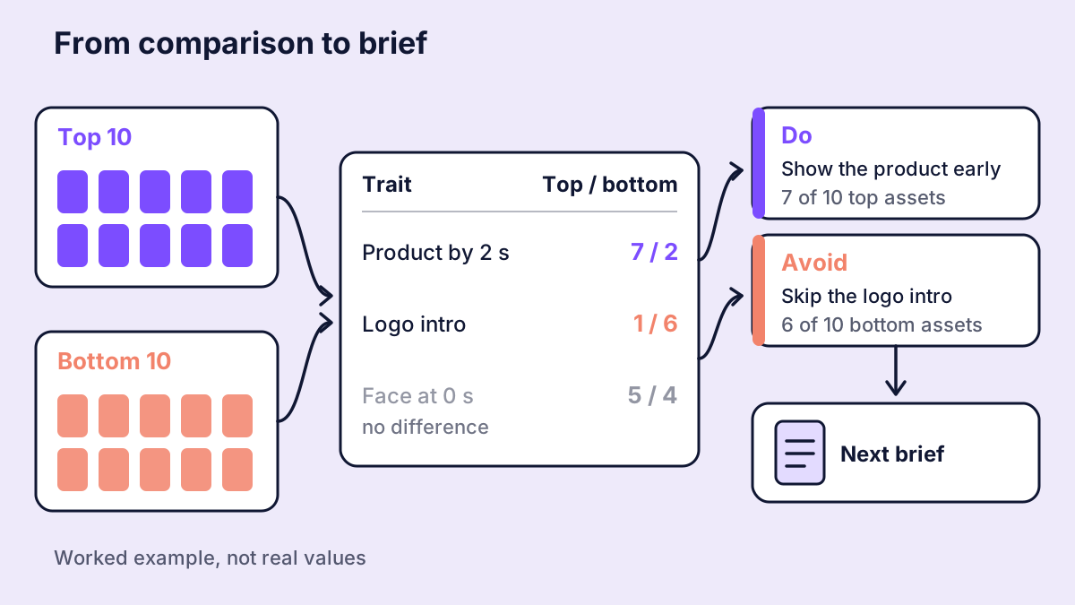
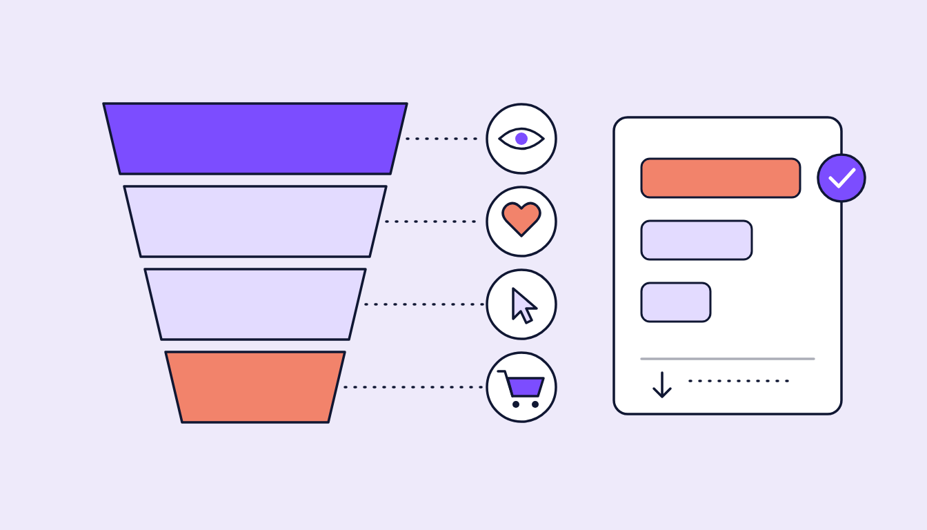
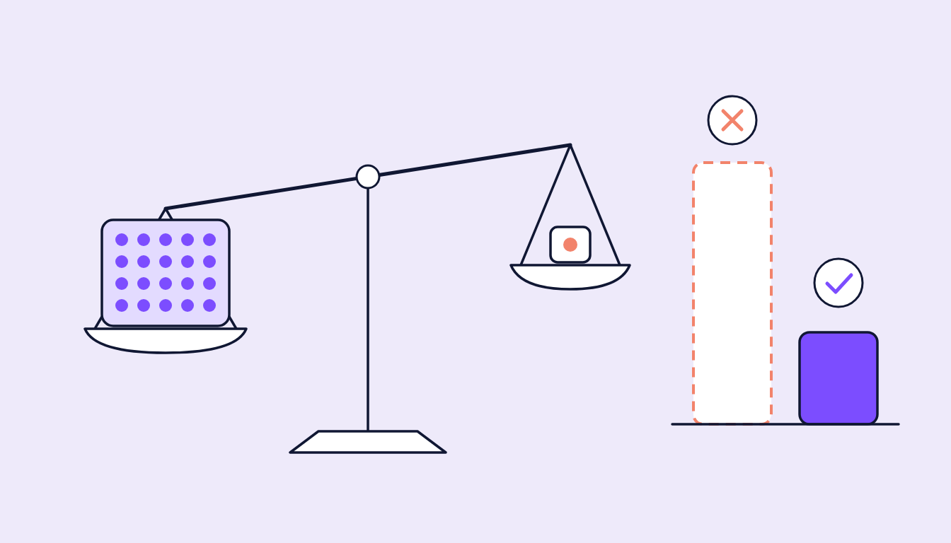
Figure 3: From comparison to brief. A pattern only counts when several assets share it.
Why a pattern only counts once several assets share it
A single top video with a face in second 0 proves nothing. It becomes reliable only when several strong videos share it and the weak ones show it less often.
So every learning carries a simple note: how many assets back it? A worked example: say seven of the ten top videos show the product in the first two seconds, but only two of the ten bottom videos do. That is a clear candidate for a do. Five at the top and four at the bottom is not a difference, it is noise.
Plus three rules we never skip:
- Patterns are account-specific. What works for one brand can fall flat for another.
- Patterns are objective-specific. A fast opening can lower CPC and do nothing for a brand video's watch time.
- Correlation is not cause. A pattern is a hypothesis for the next test, not a law.
How sugarLENS does it
sugarLENS ranks each account's videos by their objective's metric, with minimum impressions and spend. The AI analyses the strongest and weakest videos and judges each asset against a comparison group, where possible from the same account, the same platform and the same objective. With too few comparison videos, the verdict says so instead of forcing a winner or loser label.
Learnings combine the AI read with the team's reviews, need at least two assets and link to the videos they came from. They feed the next briefs and sugarOS, the creative side of the stack. Later we measure whether videos that applied a learning actually did better.
FAQ
What is a good hook rate?
There is no universal number. Platform, format, audience and objective shift it a lot. Compare with your own videos from the same account and goal.
Is it enough to optimise only the hook?
No. A strong hook gets people in, but the message moment and CTA still have to follow.
Why not compare against industry benchmarks?
Industry values help with orientation, but cannot tell which opening works for a specific brand.
How many videos does a reliable pattern need?
A pattern shared by one or two videos is an idea for a test, not a learning. It has to appear clearly more often at the top than at the bottom.